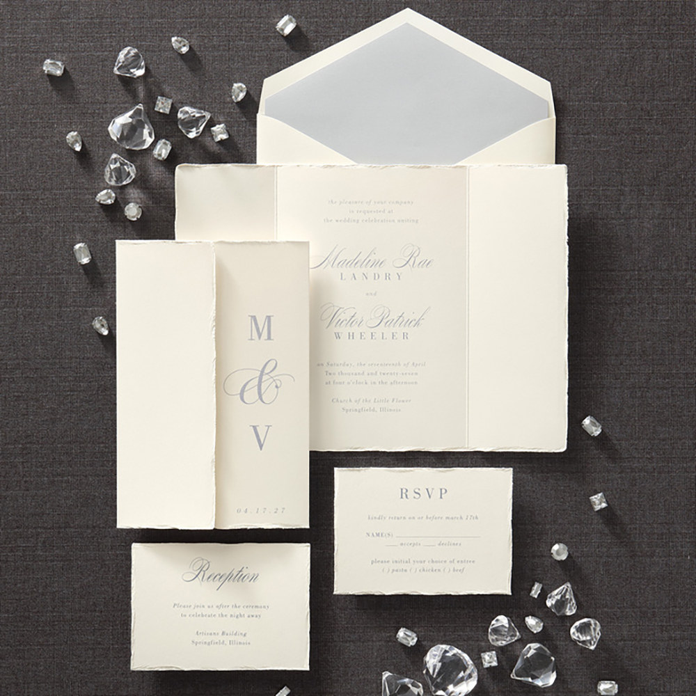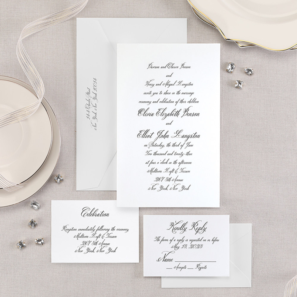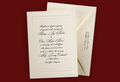
Wedding invitations are really what set the tone for the big day. They lets guests know whether the affair is on the formal side or more casual. What is often overlooked when it comes to invitations, however, is font. This is a vital element of the invitation that helps to tell your love story. Here are a few general rules to follow when deciding on a typeface for your invitations:
Keep it simple: You don’t want to send your guests something that is hard to read. Complicated fonts can often take away from the message.
Set a mood: Sure, you might like a certain font – but does it go with the style of your wedding? What you select should evoke a mood or theme.
Decorative vs. less decorative: Stray from decorative typefaces for invitations where the lines of text exceed six words.
Consider some of the favorites: Wedding inspiration blog Snippet & Ink wrangled up their favorite wedding fonts, some of which include Ambassador Script, Aphrodite Pro, Emily Lime, Harmony and Matilde.
Use spacing correctly: Highlight important text by using white space. Spacing and size differences should always be obvious.