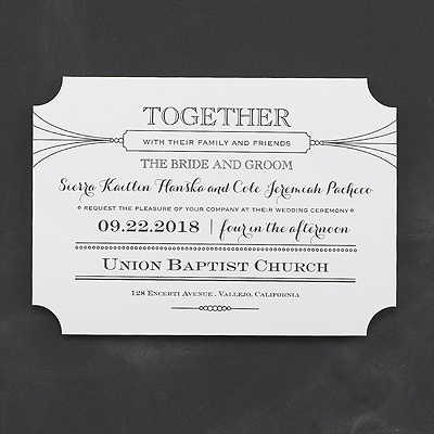
I love new takes on tradition. Like this Typography Twist Invitation’s classic typography design made stylish and modern. The die-cut corners takes the too-traditional edge off the design.
I also love it when entire wedding invitation ensembles carry through a great look to all the coordinating pieces. And this invitation does it again with reception cards and response cards with the same, unique die cut edges.
Then you just add your style with lettering and ink color choices!

