If you’ve been looking at wedding invitations for a while now, you’ll have noticed that the designers have carefully chosen fonts that complement the design. But what if you love the invitation, but want to tweak the design, just a little bit. Where do you begin? Her are six simple tips to help you get started.
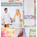
Step 1. Theme and Mood: Think about the theme and mood of your wedding. Are you going for invitations with a rustic, romantic, modern, or classic vibe? The font you choose should align with this theme and set the tone for your event.
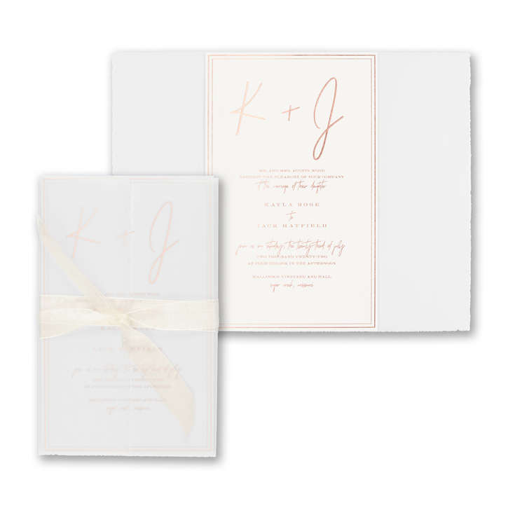
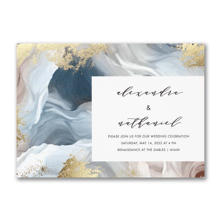
The invitation above beautifully balances classic elements. It uses the classic look of deckle paper to enhance a modern wrap. Inside, the bride has chosen the traditional look of raised ink printing in a modern shade of rosewood pink. The font choices the play their part too. The fluidity and organic nature of Sydney Regular, a contemporary script font, creates a sense of warmth and approachability reminiscent of handwritten letters, notes, and messages, while wedding details are printed in Engravure, a serif typeface with an air of sophistication and a touch of nostalgia.
Step 2. Font Styles and Personalities: Fonts come in various styles, such as script, serif, sans-serif, and decorative. Each style conveys a different mood or personality. For example, decorative script fonts often evoke elegance and formality. Serif fonts have a traditional look, while sans-serif fonts are modern and clean. Choose a font style that aligns with the overall theme and mood of your wedding.
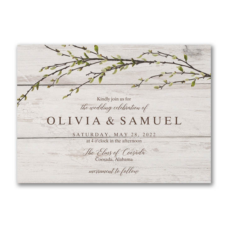
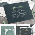
The combination of Dutch Roman and Brunella Script strikes a balance between tradition and informality, which aligns well with the rustic theme of this wedding invitation. Dutch Roman, a classic serif font (serifs are the small lines decorating the end of each letter) anchors the design with its structured and dignified appearance. The Brunella Script adds a soft and whimsical element that complements the rustic mood.
Step 3. Pairing Fonts: Using two or three complementary fonts will add depth and variety to your wedding stationery. A good combination often includes a decorative font for headings and a serif or sans-serif font for body text. Make sure the fonts you choose work well together and enhance the overall aesthetic. Pro tip: Most designers use two fonts most of the time. Sometimes they’ll use three if they want to go wild.
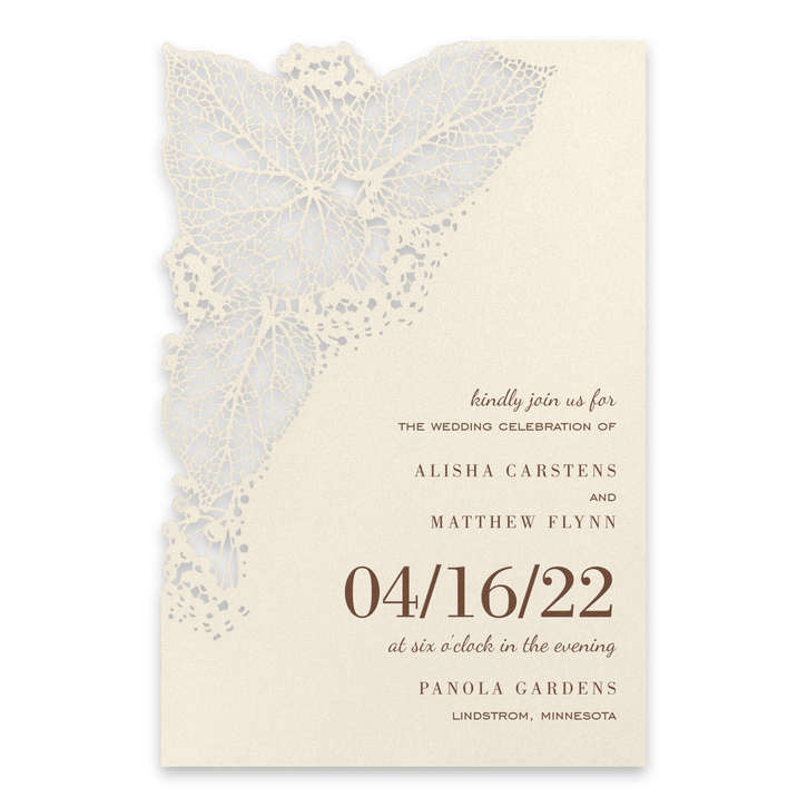
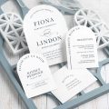
Each of the three fonts selected adds a unique visual element to this dynamic and sophisticated invitation, while allowing the intricate laser cut details to shine. Refined Bodoni presents the name and wedding date with classic style, Dancing Script adds movement and playfulness, while Engravers Gothic, a san-serif font, adds a bold and modern look that beautifully balances the design.
Step 4. Readability: Why stick to two or three complementary fonts? Readability. Your font choices should help the reader identify different types of information as it guides their eyes across the page. Too many fonts can look chaotic. And the font chosen for important information like the wedding date, venue should be easy for guests to read. Don’t pick a font that makes them have to ask if the wedding is on the 11th or 17th!
Step 5. Consistency: Using the same fonts for all your wedding stationery, including invitations, programs, and place cards helps create a cohesive and polished look. If you’ve chosen your fonts early on, you can even use them on your save the dates
Step 6. Test and Proofread: Check for any spelling errors, formatting issues, or readability problems. Keep in mind that certain fonts might not print well in small sizes or in certain printing methods (like letterpress or foil stamping), and here is where the knowledge of an experienced retailer is invaluable.
Use these tips to create an invitation that resonates with you. Think of fonts as the threads will that weave together the themes, emotions, and stories you want to share with your guests.