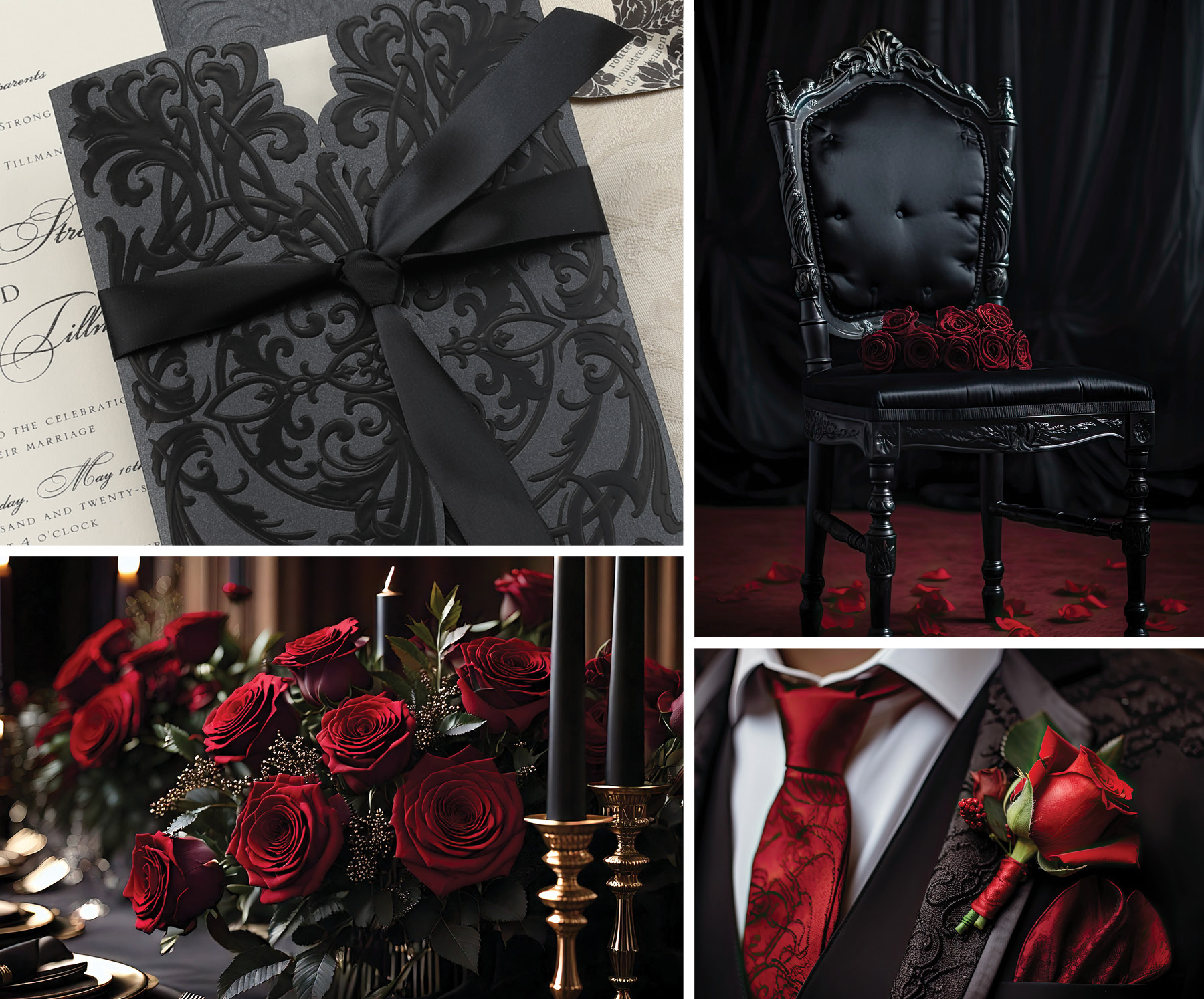
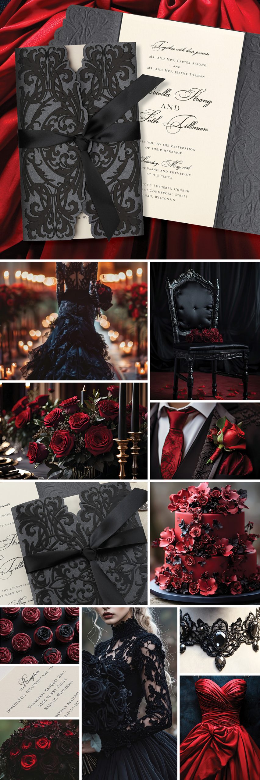
Vampy, Dramatic, and Detailed
On the darker side of romance, vampy designs focus on rich color and texture. Deep tones like midnight blue, burgundy, and black are paired with metallic foils, velvet ribbons, lacey textures, and ornate details for a look that feels bold yet refined.
One great example of this vibe is the Doorway to Love Invitation from Carlson Craft’s Luxe Wedding Collection. This invite features gatefold die-cut edges and a monochrome design in matte black foil on black shimmer paper, opening like a secret waiting to be revealed. The satin ribbon and layered inserts add depth and drama that align beautifully with vampy or gothic-inspired themes.
Damask patterns bring in a timeless, old-world charm. Whether used subtly in the background or as a standout feature, they add depth and a sense of history that makes each suite feel thoughtful and unique.
Typography leans expressive, with classic serifs, soft scripts, and decorative frames that tie everything together without feeling overdone.
More Than an Invitation
These designs do more than share the details. They set the tone and give guests a glimpse into a celebration that feels romantic, a little dramatic, and full of personality.
It is the kind of invitation that draws people in and leaves a lasting impression from the very start.