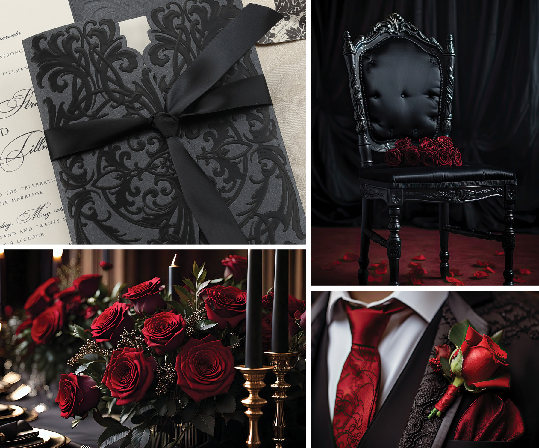
Tucked into the back of my closet in a garment bag are nine bridesmaid dresses I had the honor of wearing for friends’ and relatives’ weddings more than a few years ago. Five are various shades of dark green and four take their names from the wine cellar – merlot, burgundy, bordeaux and claret. Back in my bridesmaid heyday, rich dark tones were the hue du jour: dark greens, rich reds, and blues so dark they nearly looked black. To deepen the heavy effect, velvet was a popular fabric choice. You would have been hard-pressed to find pastels, and bright, vibrant colors were just not to be found on the bride’s color wheel. My mother would wax poetic about her days of light blue, mint and peach bridesmaid dresses complete with veiled pillbox hats and gloves. She prophesied that someday lighter colors would make a strong comeback. I eyed her skeptically and tried to imagine such a world.
And here we are!
Pantone’s fashion color report for 2013 heralds a return of lively colors. “Lemon Zest,” “Nectarine,” and “Poppy Red” are just a few of the Pantone shades that are hot topics this year. Brides looking for a punch of color can try “African Violet,” a happy lilac tone, or “Tender Shoots,” a nod to a bubbly spring green color. Those looking for something a bit more subdued might choose “Monaco Blue,” a darker shade which calls to mind an officer’s uniform, or the pretty and feminine “Linen,” a close relative to a champagne tone.
But what’s the one color everyone is talking about this year? The honor goes to “Emerald.” It seems to me that if teal and jade were to pool together, Emerald would be the subtly bold color they would create. It’s a lively, jaunty hue that has endless possibilities for color pairings and accents. Summer’s riot of colorful flowers will certainly complement Emerald well, and will offer up a festive décor ensemble.
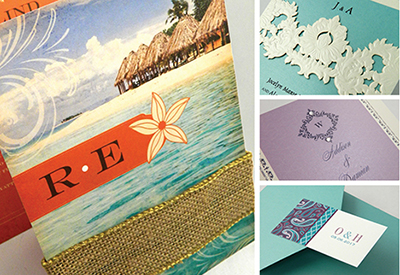
For brides looking to run with these snappy colors, Carlson Craft has a full lineup of invitations and stationery that incorporate these very last vivacious hues. Notice these fun colors in the pictures? Heavy, rich an deep have made way for light, cheerful and vibrant! These colors create a playground of bright and buoyant design options, and infuse a winsome mirth back into wedding themes. Look for coordinating Carlson Craft ink colors in Peacock, Canary, Monarch, Watermelon, Lavender, Granny Apple and Admiral to capture this season’s hot hues.

Styles and trends come and go, cycling back around to return to favor with a newer and younger generation. The brides of 2013 are enjoying a return to a colorful palette loaded with vitality and verve. Who would have thought? One more thing my mother was right about!
And here we are!
Pantone’s fashion color report for 2013 heralds a return of lively colors. “Lemon Zest,” “Nectarine,” and “Poppy Red” are just a few of the Pantone shades that are hot topics this year. Brides looking for a punch of color can try “African Violet,” a happy lilac tone, or “Tender Shoots,” a nod to a bubbly spring green color. Those looking for something a bit more subdued might choose “Monaco Blue,” a darker shade which calls to mind an officer’s uniform, or the pretty and feminine “Linen,” a close relative to a champagne tone.
But what’s the one color everyone is talking about this year? The honor goes to “Emerald.” It seems to me that if teal and jade were to pool together, Emerald would be the subtly bold color they would create. It’s a lively, jaunty hue that has endless possibilities for color pairings and accents. Summer’s riot of colorful flowers will certainly complement Emerald well, and will offer up a festive décor ensemble.
For brides looking to run with these snappy colors, Carlson Craft has a full lineup of invitations and stationery that incorporate these very last vivacious hues. Notice these fun colors in the pictures? Heavy, rich an deep have made way for light, cheerful and vibrant! These colors create a playground of bright and buoyant design options, and infuse a winsome mirth back into wedding themes. Look for coordinating Carlson Craft ink colors in Peacock, Canary, Monarch, Watermelon, Lavender, Granny Apple and Admiral to capture this season’s hot hues.

Styles and trends come and go, cycling back around to return to favor with a newer and younger generation. The brides of 2013 are enjoying a return to a colorful palette loaded with vitality and verve. Who would have thought? One more thing my mother was right about!

